Analysing the navigation patterns on the SDE Service page
This week a lot of my work has, from a variety of different directions, coalesced around an analysis of the navigation patterns on the old NHS Digital website, where the Secure Data Environment Service page (on which I am currently working), and many of the other digital services hosted by the NHS can be found.
Part of the challenge of this is that these services use the old NHS Digital branding and Design System, and are not therefore compliant with the GDS Design System or the GDS inspired NHS Service Manual. When I say "old", what I mean is the branding and content management systems are from when NHS Digital was a separate entity, and not, as now, merged and integrated with NHS England.
Whilst plans are apparently afoot to migrate and rebrand this content, aside from this legacy silo and back-office systems integration and content/service strategy issue, the challenge I have been exploring is not necessarily linked to the old NHS Digital Design System per-say, but rather what appears to be a conscious or sub-concious design decision regarding the CMS, or the platform on which the site has been built - namely the site being formed of lots of pages of largely static content. This is also perhaps a product of a related phenomenon - the lack of apparent consideration of high-level service patterns and commercialisation objectives that some of these pages are intended to support.
These pages, like with many drag and drop style CMSes, are designed to be used by non-technical users to easily add, update and move around largely static content, and this fact architecturally has, one can infer, resulted in lots of static content blocks containing text or non-interactive content being added to the page. An indication around potential pricing for the SDE service becomes a lengthy screed of informative text, when it could have been a more interactive 'wizard' interface not just giving static illustrative or indicative pricing information to a prospective or current service user, but could also be more dynamically gathering actual information from the user about their needs or requirements, and in so doing be used to assess the likelihood of successful lead-conversion or help the user to not have to repeat themselves twice.
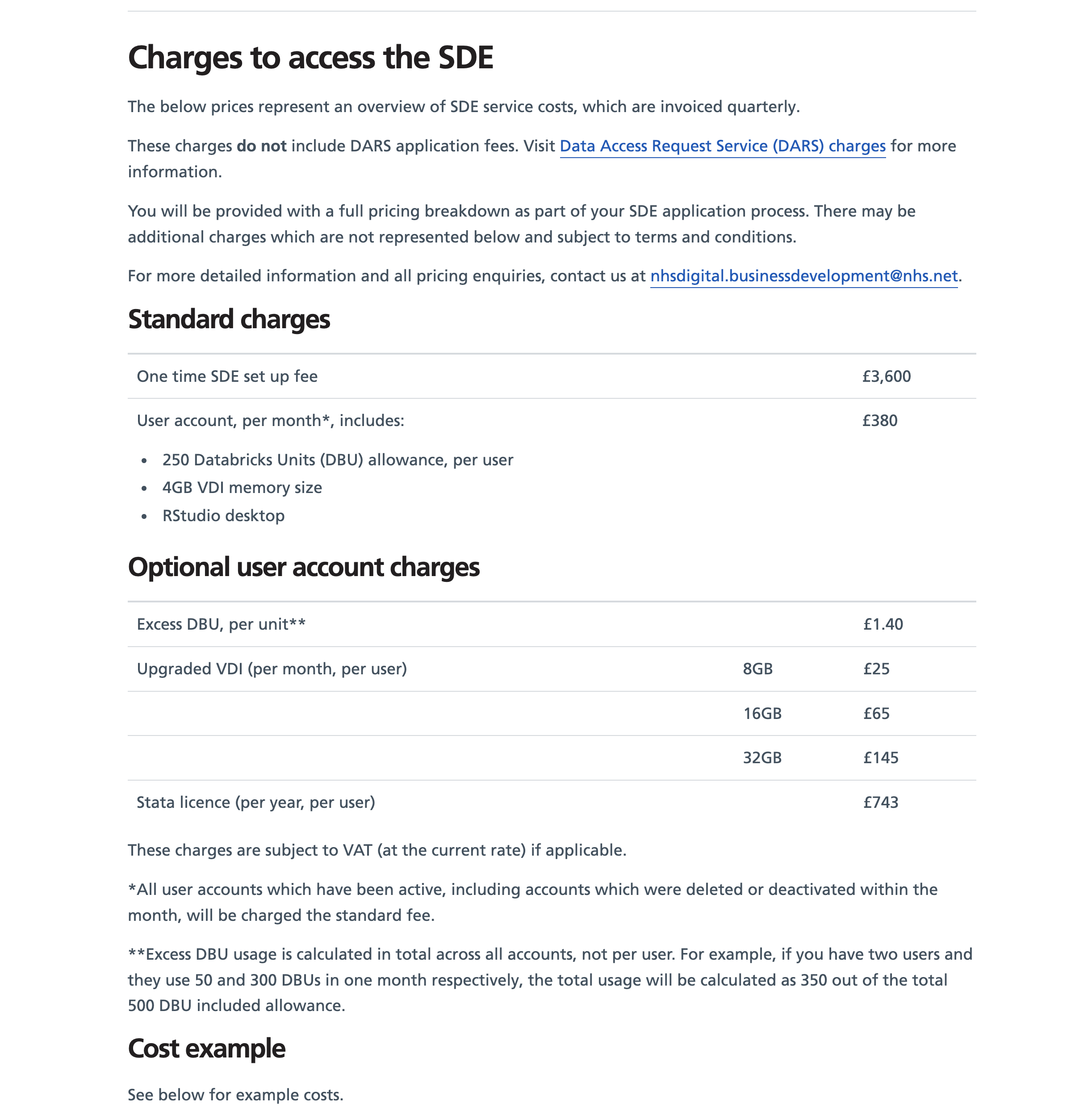
Whilst there is nothing inherently wrong with either this specific section of the page, or any of the content on the page, aside from adding more and more length to the page, thereby decreasing the chances of users successfully scrolling to the bottom of the page and completing the service transaction or call-to-action.
Turning these pages into one-stop-shops for all content relating to a service, but not providing any way for the user to customise or filter that content based on their particular needs, interest, experience, my current working hypothesis supposes, has a significant impact on the likelihood of a user being able to complete a particular service transaction that they came to the page to complete, whether that is to allow a user access to a service, or to support the user to research and gather their own information about a service prior to registering or expressing interest.
Again, it is not entirely clear if this is by design or more just a cumulation of a number of years of new service pages being added to the NHS Digital site as an when they are launched and similarly, new content being added to the service pages as and when changes are required. In this specific case though, and as we approach our private beta service assessment there is a need I think, to be slightly more clear sighted about how the user experiences the 'onboarding' or front-end of the 'end-to-end' service process. At the moment the service page, whilst comprehensive doesn't actually sign-post user to the service itself very clearly, and instead provides a lot of 'sideways' links to supporting and often duplicated and overlapping information and content.
I'm minded to consider some of the GDS guidance on content pages:
It's okay to duplicate small amounts of information ... if it means keeping the user inside the transaction. But if you need to do this a lot then your service is probably too complicated.
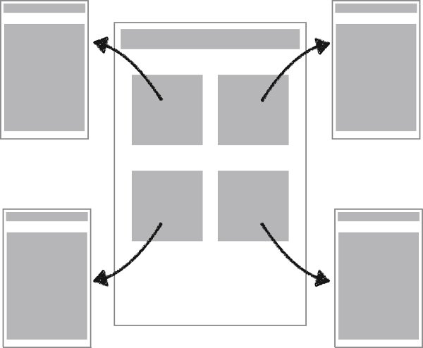
As I say, it is unclear if this is a concious design choice, but, whether by accident or design one can analyse this as a design pattern known as hub and spoke, or springboard.
More pressingly, what this static content system/strategy also leads to is an increase in horizontal navigation pathways where non-technical, or time constrained administrators, web editors or communication teams simply add more and more new content blocks to pages in the CMS, as a result of changes or requests for improvement. When these pages start getting too long or unwieldy, the administrators just add more pages.
Whatever the original intention, and however unintended, what this results in for users is having to scroll very deep down most pages navigating past content that may or may not be relevant to them, and, if they follow the 'sideways' links to other supporting or relevant information also a challenge for users to stay within a particular goal-oriented transaction, or task-flow and complete the service transaction or background research journey they most likely came to the page to complete.
Expressing Interest in the SDE (or an Equivalent 'First Contact' Call to Action)
A user might arrive at the SDE page with no prior knowledge of the service, perhaps as a result of a Google search, or following a link from a colleague and rather than this page being a one stop shop for all the information relevant to the SDE service, they are instead sent off to a wide variety of different links to gather related and relevant information, such as information about the Data Access Request Service (DARS) which is a pre-requisite step or service that anyone requesting data from the NHS is required to engage with.
The reason for these two services is the classic public sector silo effect, that these two services emerged during some hasty and necessarily developer driven processes during the Covid-19 pandemic, with the Data Access Request Service being built as a bottom-up endeavour to handle all requests for data within the NHS, whilst the SDE, (or Trusted Research Environment TRE as it was then known) was built to deliver that data in a secure way as a response to the Goldacre Review and as such is more of a top-down process.
In an ideal world these two services would be completely integrated and users would be redirected through what is now the DARS onboarding and registration process - as a microservice - without ever knowing. Users' goal after all, is to get access to data, not explicitly to register to request data, or explicitly to access a Secure Data Environment. As such the Secure Data Environment is a typically noun-y "bad service name" one often finds in the public sector.
Part of my current work is reflecting upon the end-to-end process for this service, and designing some improvements to the Expression of Interest Form / flow, and Registration Process / flow for this service.
User research a few weeks ago highlighted that anyone scoping the viability or suitability of the the SDE service specifically, or looking to gain access to our use any of the data that happens to be delivered within the SDE, might spend a disproportionate and often times overwhelming amount of time moving 'horizontally' and 'round in circles' within the NHS Digital site, being linked 'left' and 'right' or sideways to different sources of information about the SDE Service, the data it contains, and then sideways again into the DARS system, and the guidance around the application process there should they deem that they might wish to proceed to expression of interest or registration.
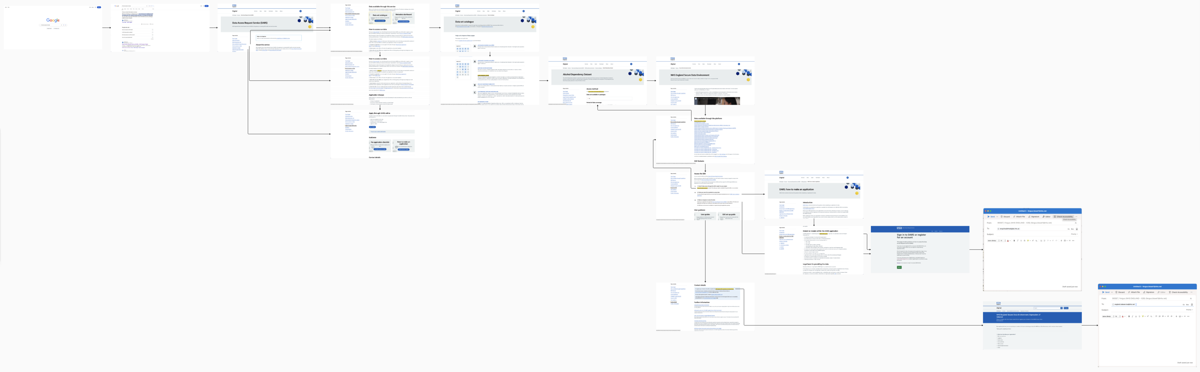
By sideways in this context I mean moving laterally to different sources of content and information hosted on separate URLs and pages, instead or progressing stage-by-stage towards their goal or applying for, and accessing data.
Improving the Design; moving from 'springboard' to 'transaction'
Improving this design, involved drawing heavily on the GDS pattern (Check a service is suitable) and the related GDS Content Transactions.
Specifically,
"Instead of asking the user to read and understand complicated eligibility criteria on a GOV.UK guidance page or start page, you can ask them some simple questions within your transaction".
and also,
"Handle more complex eligibility through routing questions within your transaction. For example, if someone lives abroad and their eligibility depends on which part of the UK they used to live in. This approach means you:
- only show information to the people it's relevant to
- give advice tailored to the user's situation
- reduce time and money spent processing queries from users confused about whether they can use your service"
I think, with a view to the complex flows described above and analysed as part of the user research the following quote is also relevant:
Whilst it would be more normal for some of these issues to be ironed out in the alpha phase of service development, we are approaching the end of private beta, and perhaps because of the aforementioned silo-ing of the services, and the limitations of the CMS, some of these kinks in the user experience have not yet been ironed out.